
Are you looking for a unique way to elevate your web designs? The inverted border radius effect, created using CSS mask, is a modern and eye-catching technique that can make your website stand out. This innovative design trick adds a fresh perspective to traditional border-radius styling, giving your elements a sleek and creative look. In this guide, we’ll walk you through the process of using CSS mask to achieve the inverted border-radius effect, making your designs both stunning and professional. Whether you’re a beginner or an experienced web designer, this tutorial will help you add a stylish touch to your projects. Let’s get started!
What is the Inverted Border Radius Effect?
The inverted border radius effect is a design approach that involves masking specific areas of an element’s borders to create a “cut-out” appearance. Unlike traditional border-radius styles that curve the edges, this technique uses CSS masking properties to produce an inverse effect, offering more creative freedom in web layouts.
This effect can be implemented using the mask or -webkit-mask properties, often combined with images or SVGs to define the masked areas. The result is an innovative and visually stunning design that enhances user engagement.
How to Create Inverted Border Radius with CSS Mask
Let’s dive into the steps required to implement the inverted border-radius effect using the provided HTML and CSS files.
Setting Up the HTML Structure
Your HTML file needs to include a wrapper with the desired content for the inverted border effect. Here’s an example:
<!DOCTYPE html>
<html lang="en">
<head>
<meta charset="UTF-8" />
<meta name="viewport" content="width=device-width, initial-scale=1.0" />
<link rel="stylesheet" href="style.css" />
<!-- Font Awesome CDN Links -->
<link rel="stylesheet" href="https://cdnjs.cloudflare.com/ajax/libs/font-awesome/6.7.1/css/all.min.css" integrity="sha512-5Hs3dF2AEPkpNAR7UiOHba+lRSJNeM2ECkwxUIxC1Q/FLycGTbNapWXB4tP889k5T5Ju8fs4b1P5z/iB4nMfSQ==" crossorigin="anonymous" referrerpolicy="no-referrer" />
<title>Inverted Border Radius</title>
</head>
<body>
<div class="container">
<div class="card_wrapper">
<div class="card">
<div class="card-image-with-svg-mask">
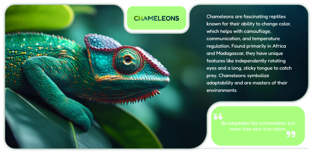
<p class="text">Chameleons are fascinating reptiles known for their ability to change color, which helps with camouflage, communication, and temperature regulation. Found primarily in Africa and Madagascar, they have unique features like independently rotating eyes and a long, sticky tongue to catch prey. Chameleons symbolize adaptability and are masters of their environments
</p>
</div>
</div>
<div class="button top-center"><span class="text">Chameleons</span></div>
<div class="button bottom-right"><span class="text"><i class="fa-solid fa-quote-left"></i> Be adaptable like a chameleon, but never lose your true colors.<i class="fa-solid fa-quote-right"></i></span></div>
</div>
</div>
</body>
</html>
Styling the Elements with CSS
To achieve the inverted border-radius effect, we use the CSS mask and -webkit-mask properties.
/* Fredoka Fonts */
@import url('https://fonts.googleapis.com/css2?family=Fredoka:wght@300..700&display=swap');

* {
    padding: 0;
    border: 0;
    box-sizing: border-box;
}

body {
    background-image: url("");
    background-size: cover;
    font-family: "Fredoka";
}

.container {
    display: flex;
    justify-content: center;
    align-items: center;
    flex-direction: column;
    height: 100vh;
}

.card_wrapper {
    position: relative;
}

.card {
    position: relative;
    filter: drop-shadow(0 0 5px #024120ca);
}

.card-image-with-svg-mask {
    width: 80vw;
    height: 80vh;
    background-image: url("/images/chameleons.avif");
    background-position: 0%;
    background-repeat: no-repeat;
    background-size: cover;
    background-attachment: scroll;
    border-top-left-radius: 2.5rem;
    border-top-right-radius: 2.5rem;
    border-bottom-left-radius: 2.5rem;
    position: relative;
}

/* mask image */
.card-image-with-svg-mask {
    -webkit-mask: url("/images/top-center.png") center / contain no-repeat, url("/images/bottom-right.png") center / contain no-repeat, linear-gradient(#000000 0 0);
    mask-size: 22rem, 30rem;
    mask-position: top center, bottom right;
    mask-composite: exclude;
}

p.text {
    color: #ffff;
    width: 350px;
    position: absolute;
    right: 5%;
    top: 2%;
    font-size: 20px;
    line-height: 1.5;
}

.button {
    position: absolute;
    background-color: #a9ff7d;
    border-radius: 1.5rem;
    padding: 20px;
    display: flex;
    justify-content: center;
    align-items: center;
}

.top-center {
    width: 240px;
    height: 95px;
    top: 1%;
    right: 0%;
    left: 0%;
    margin: 0 auto;
}

.top-center .text {
    font-size: 28px;
    font-weight: 600;
    text-transform: uppercase;
    background: url("/images/chameleons.avif") top / cover no-repeat;
    background-clip: text;
    color: transparent;
}

.bottom-right {
    width: 380px;
    height: 160px;
    border-radius: 2.5rem;
    bottom: 2%;
    right: 1%;
}

.bottom-right .text {
    font-size: 19px;
    text-align: center;
    position: relative;
    color: #fff;
}

.fa-quote-left, .fa-quote-right {
    position: absolute;
    font-size: 40px;
    color: rgb(245,245,245);
}

.fa-quote-left {
    top: -35px;
    left: -10px;
}

.fa-quote-right {
    right: 20px;
    bottom: -30px;
}
Tips for Customizing Your Design
Experiment with Mask Images
Try different shapes and sizes for your mask images to create unique cut-out effects.
Adjust the Mask Size and Position
Use mask-size and mask-position to control the size and placement of the masked areas for your specific design needs.
Add Shadow Effects
Enhance the visual appeal by adding subtle shadow effects using filter: drop-shadow.
Benefits of Using CSS Mask for Border Radius
Enhanced Creativity
This technique allows you to design web elements that stand out from traditional borders and shapes.
Lightweight and Fast
CSS masking is a lightweight solution that doesn’t require heavy graphic files or complex scripts.
Versatile Applications
You can use this effect on images, buttons, or even sections of your webpage for creative layouts.
Conclusion
The inverted border-radius effect using CSS mask is a powerful design tool that adds a modern and stylish flair to your web projects. By combining creativity with the simplicity of CSS, you can craft unique elements that captivate your audience. Try experimenting with this technique and see how it transforms your designs!
Ready to take your designs to the next level? Start using the inverted border-radius effect today!
FAQ
What is the key advantage of using inverted border radius?
The main advantage is its ability to create unique and visually striking designs, setting your project apart from standard layouts.
Can I use inverted border radius with any element?
Yes, this effect can be applied to most block-level elements like divs, images, or sections.
Do all browsers support CSS mask properties?
Most modern browsers support CSS masking, but it’s always a good practice to check compatibility for specific use cases.
How can I make the inverted border radius responsive?
You can achieve responsiveness by using relative units (e.g., vw, vh, %) for the mask size and position.
What file formats can be used for masks?
You can use SVG, PNG, or other image formats, but SVG is recommended for scalability and quality.
How can we make this responsive?
use media query and clamp() to change mask size to make it responsive
I tried this. But Chameleon image is not popping. Is there any other code we need to change.
Please help.
i think you missed the linear gradient in css .card-image-with-svg-mask